Doc Jon's
Doc Jon’s is a branding project I worked on for a hypothetical micro-hotel and bar. This was an assignment for a design class during college. We were tasked with creating a brand for the business or product of our choosing. I chose to work on Doc Jon’s because it was an idea I had a while back and was excited about the idea of flushing it out a little more. The hotel would be in the style of a victorian mansion and the bar would be in a traditional parlor. The goal of this project was to convey the unique experience of staying at Doc Jon’s as if it was his house. Tools used: Indesign, Illustrator.
Initial Direction
I wanted it to feel like you’re staying at some Victorian-era socialite's house in the country, but with more modern amenities and comforts.
Brainstorming
Here is my first round of sketches. I really liked the pipe and the house ideas but realized that they would be very difficult to use as logos. I decided on the glasses because they had a personal yet old-timey feel, which is what I was going for.
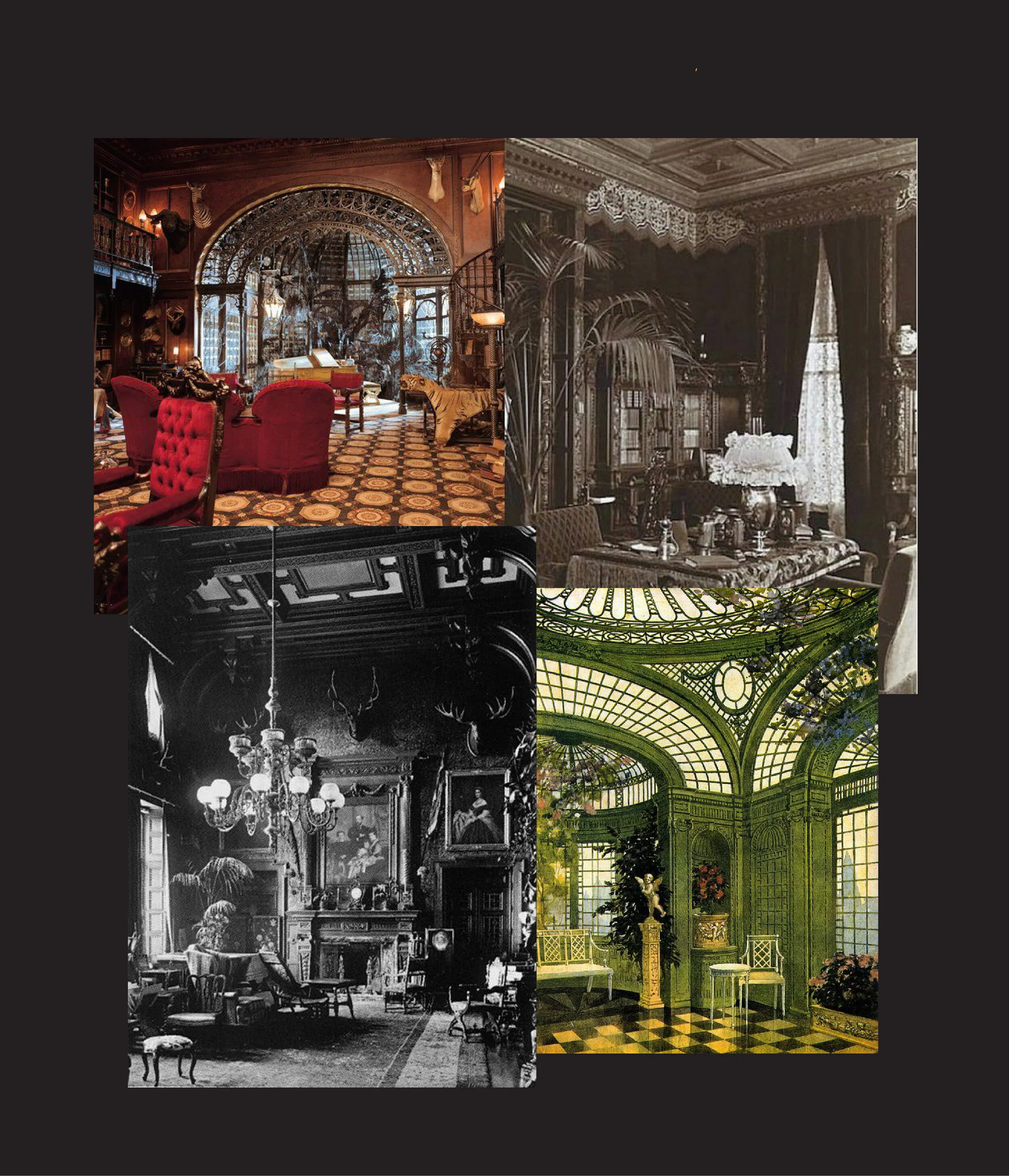
Interior Inspiration
This is a mood board of what vibes I wanted Doc Jon’s to embody. A little cozy, a little grand, and maybe even a little spooky.
First Draft of the Letterhead and Business Cards
Here is my sketch of what I wanted the stationery and business cards to look like. This was my final sketch before starting to design them digitally.
Business Cards
This was my final design for the business cards. As you can see, they are much more simplified than what I had in the sketch. They were getting a little too busy, and my professor pointed out that some of the greens and yellows were difficult to read. I toned it down to what you see here.
Letterhead and Envelope
This is my final design for the stationary set. This was also toned down from the initial design to create a more simplified look. Overall, these final versions pair much better with the logo and with the vibes from the mood board. With the help of my professor’s critique, I was able to make a simple, unified brand for Doc Jon’s.


